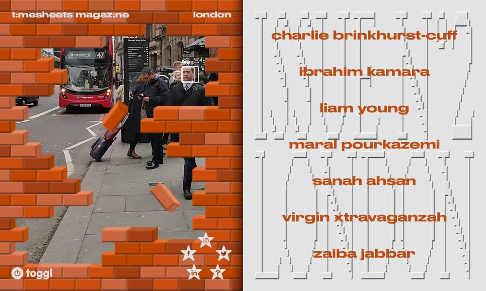
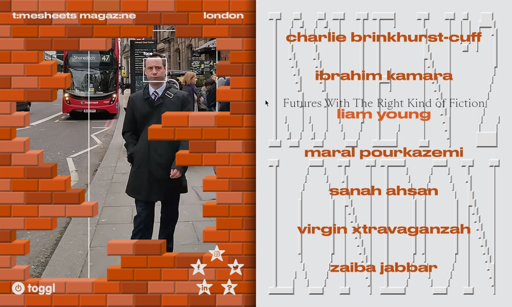
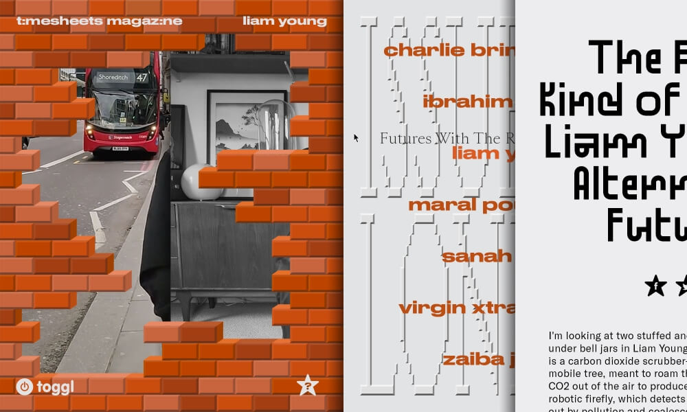
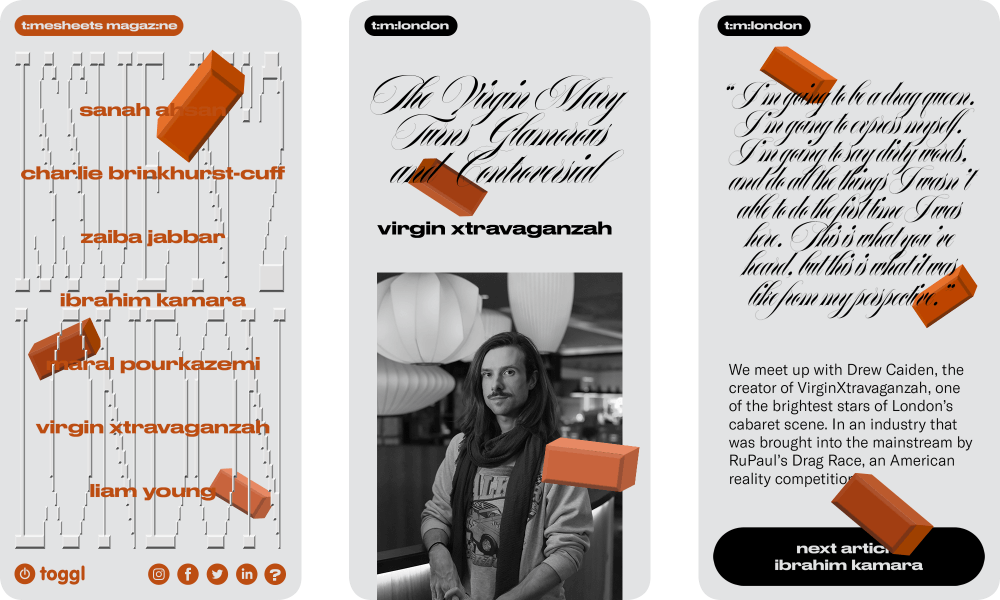
Timesheets is a digital magazine featuring successful creatives, with each issue centered around a different city. The London issue focuses on activists breaking down walls on several fronts, so we recreated that experience for the reader to participate in. The 2D bricks anchor the magazine not only in London, but also in a distinctly digital space. In reproducing the effect of print, the digital magazine remains flat like a page, but the intuitive scroll-to-read, playful pop-ups, and mixture of typefaces defy the traditionally uniform two-page spread.
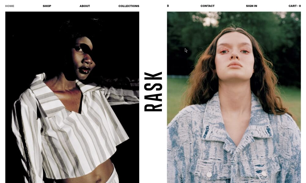
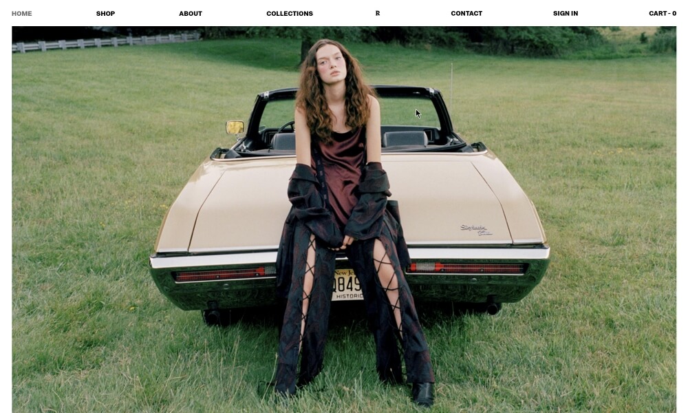
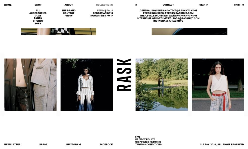
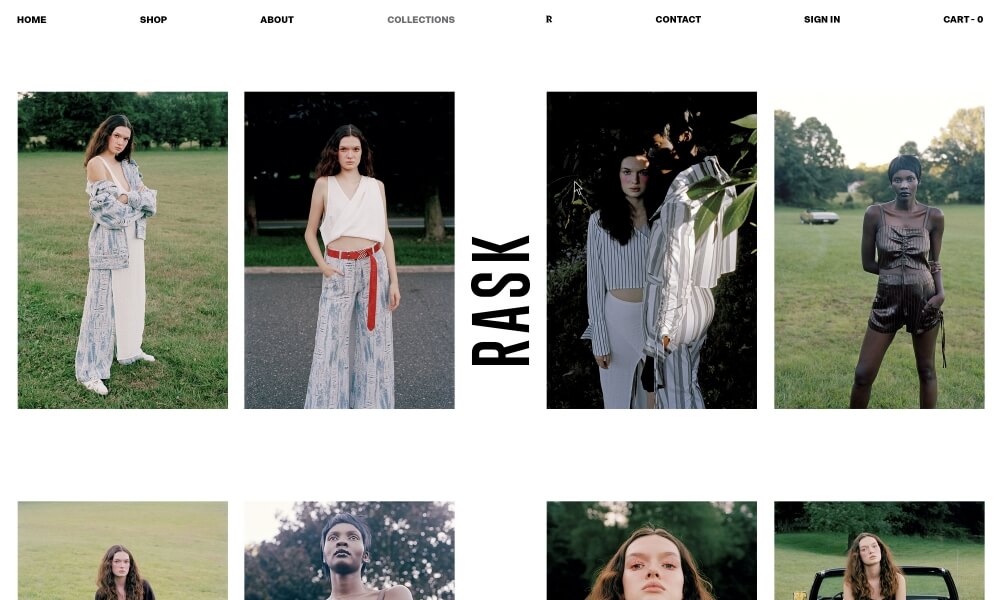
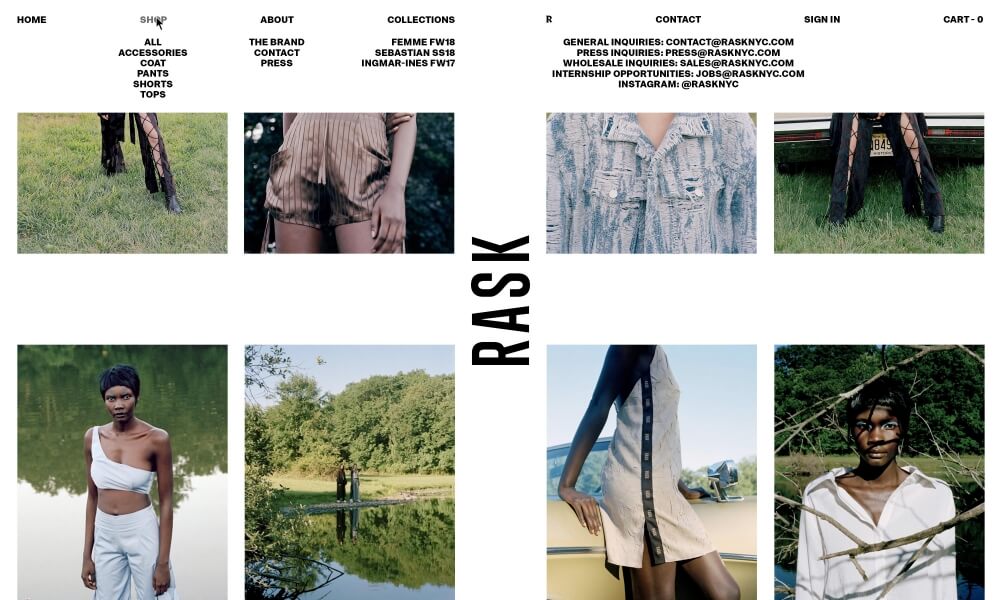
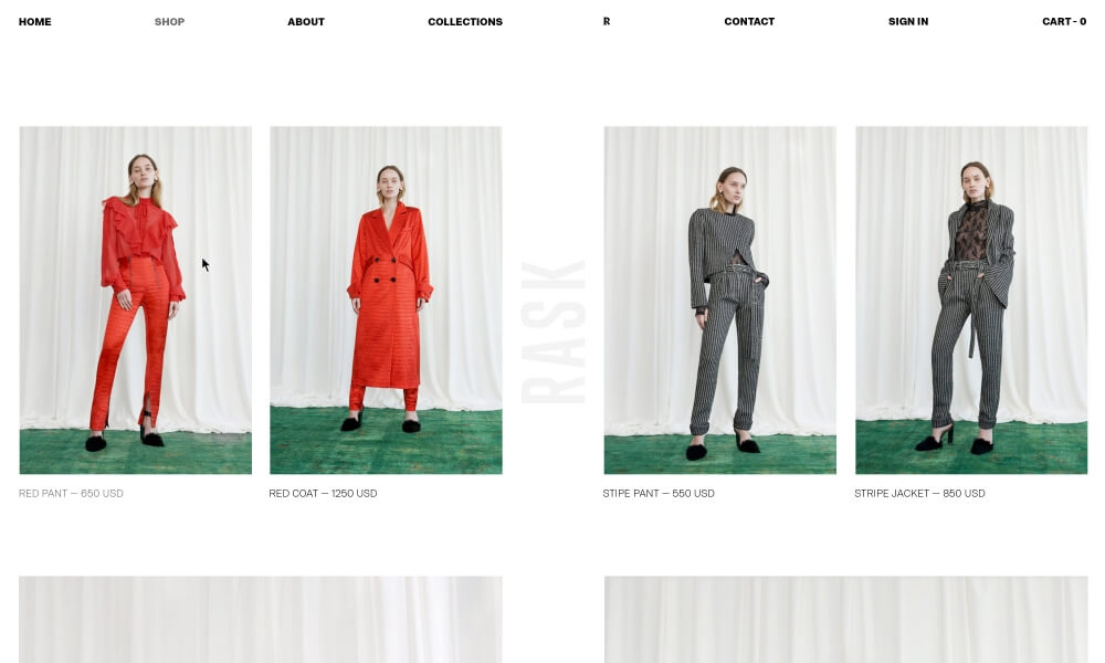
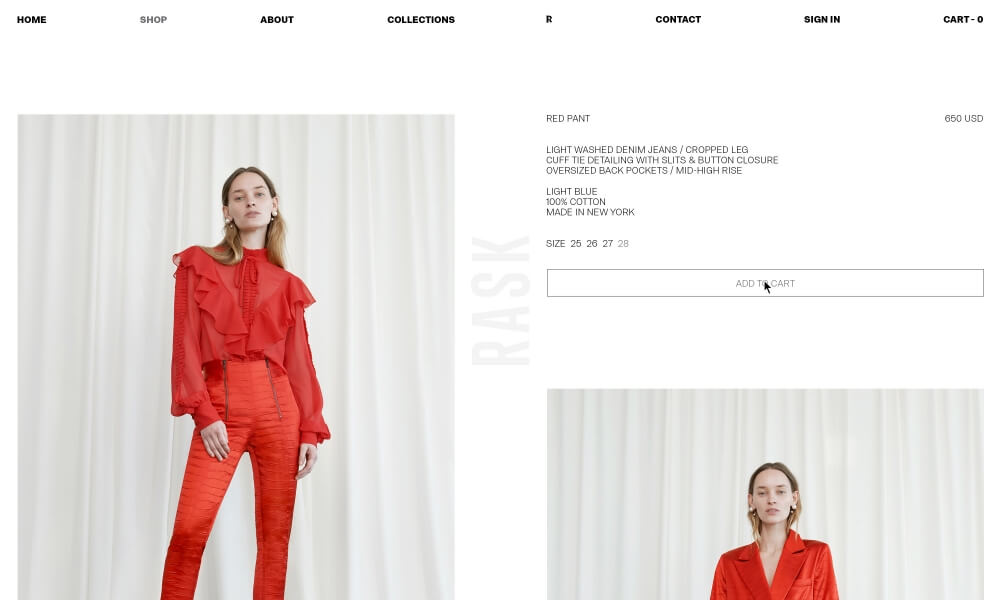
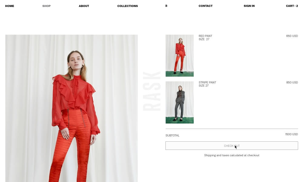
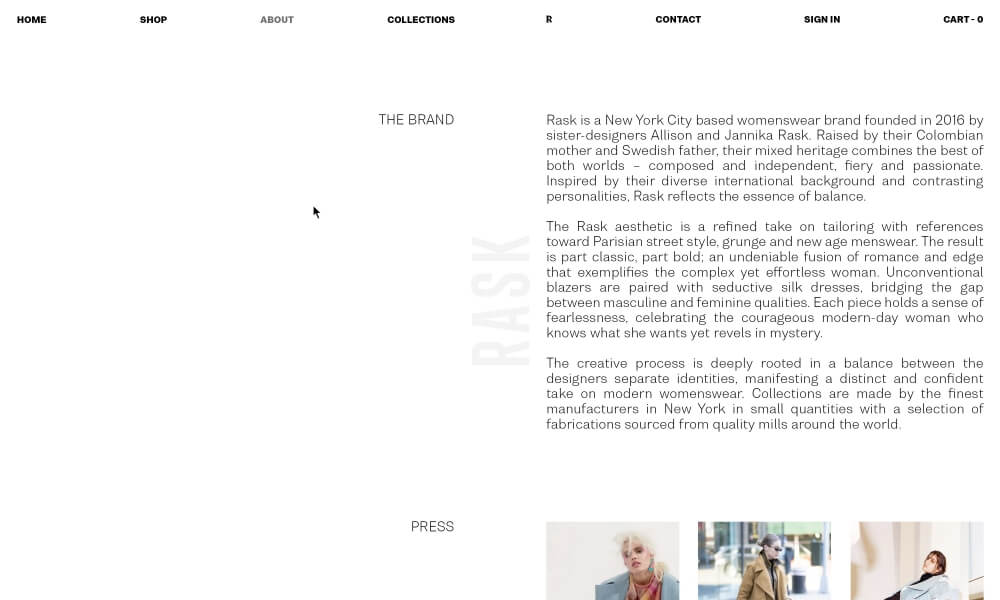
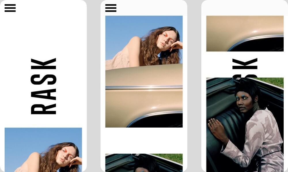
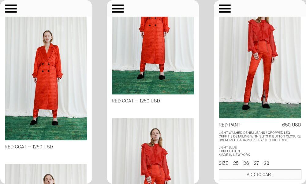
Rask is an emerging womenswear brand based in NYC. We have been working with the brand continuously from its inception until today. Besides the webdesign and development, we conceived a bold logo, labels, using high contrast & symetry between the different elements. The menu which extends completely once hovered allow fast access to every page.
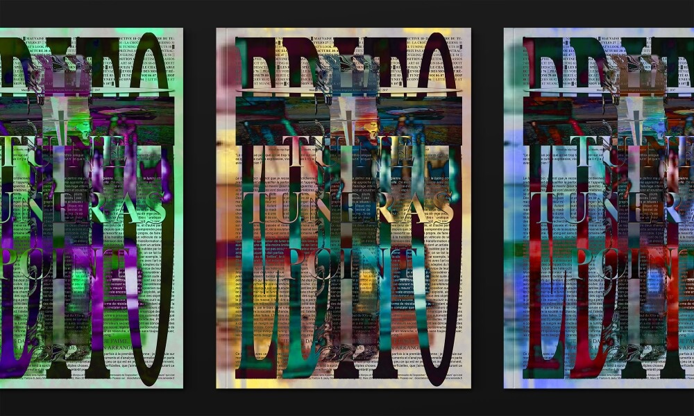
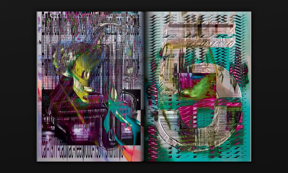
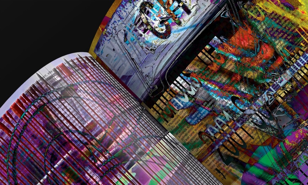
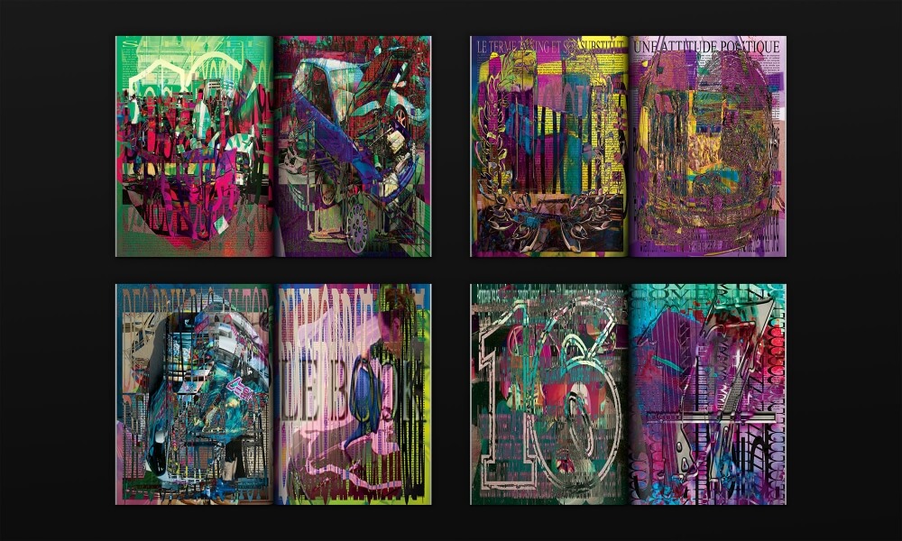
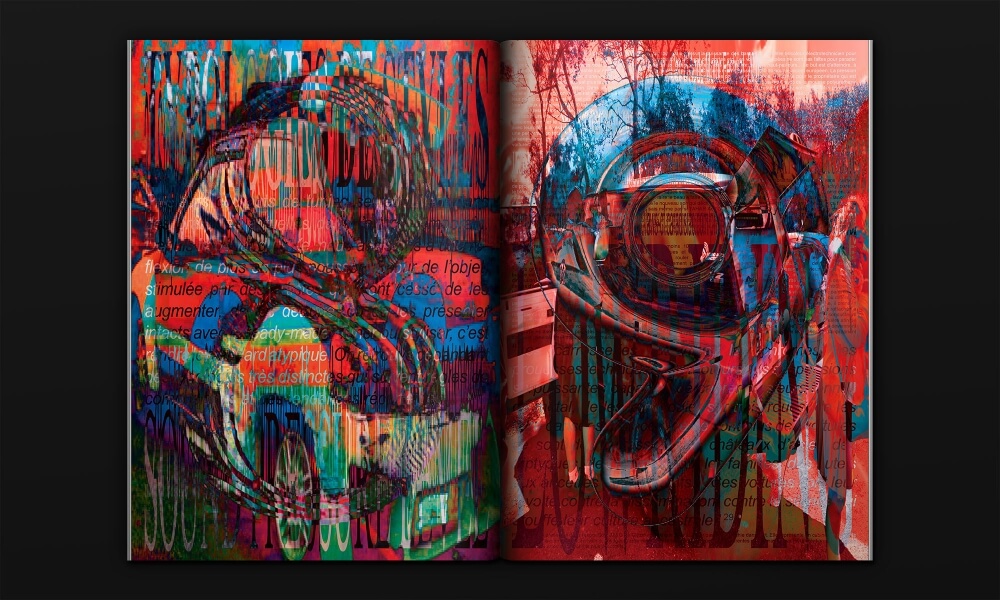
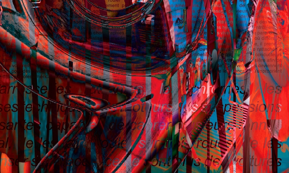
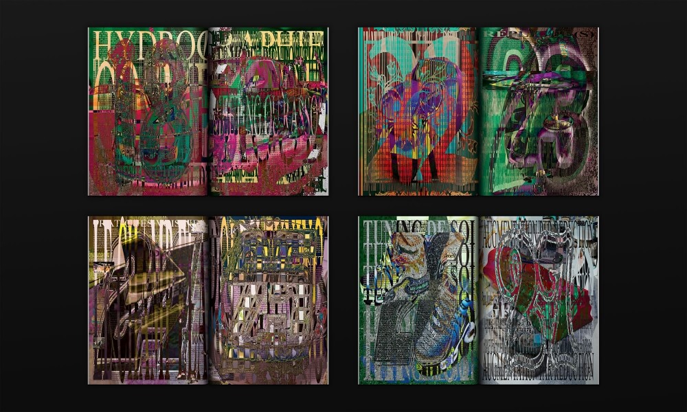
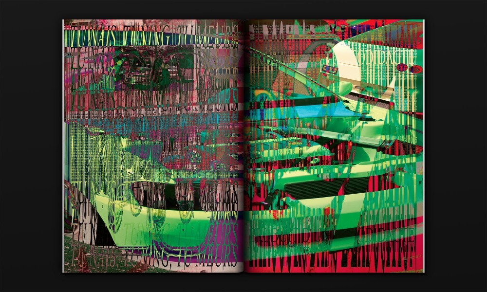
“Tu Ne Tuneras Point” is an editorial project about tuning. When we think about tuning, we think form above function, an object that is almost not practical for its original function. We decided to recreate this by superposing every title, text, image; and making 110 pages fit into 28. Focusing only on form, and not function, we made the book’s content almost unreadable.